Did you know colour can alter your thoughts and affect team performance?
That is why colour is the biggest business you’ve never heard of.
Companies dump millions every year into picking the ‘right’ colour for their brand that often results in positive gains.
It’s in your face everyday; Facebook has their iconic blue, Google has their distinctive rainbow palette. McDonalds has their golden yellow arches, the colour code is RGB: (255,199,44) by the way.
Our marketing manager bought a Google Pixel 3 this week and is moving away from his trusty Iphone.
Apple’s approach is to use an aggressive green to deliberately highlight non Apple devices. In contrast they use and a soft, eye friendly blue for iMessages. This is no accident. The new Google Pixel 3 is a pretty innovative device by the way.
Successful companies embrace memorable colours. Colour cultivates emotional engagement and increases productivity by exciting synapse in the frontal lobe. This human trait dates back to our ape origins. Ripe fruit is a more appealing colour than rotting fruit, wouldn’t you say?
In short-colour affects your brain.
That’s why it’s important to pick the right colour scheme for your dashboard.
The be a colour choosing beast, you need to know what colours make your more productive, how to use colour, and how many colours to chose.
To boost your chances for scoring the best colour scheme for your dashboard, we are going to outline 3-key factors to contemplate when mastering your colour selection.
1: The 3-colour tones and how they impact your mind
2: How many colours is too many colours
3: What colours decrease productivity
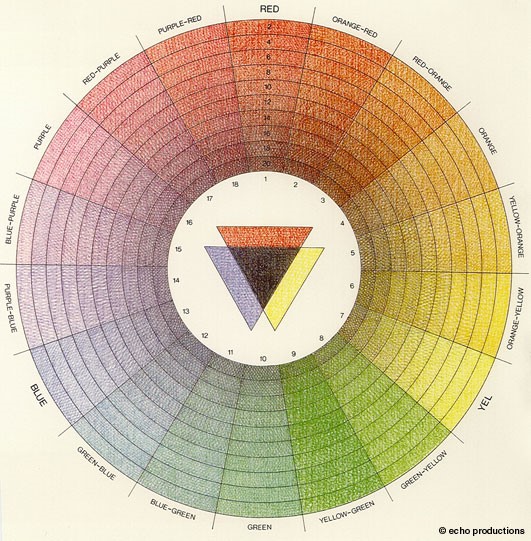
The 3-Colour Tones And How They Affect Our Minds

There are basic colour tones.
Each colour tone has a specific impact on our mind. To figure out what colours make you more productive, you need to understand what each tone means.
Here are the three tones:
1: Warm - These are reds, oranges, and similar shades.
2: Cool - These are blue, purple, etc.
3: Neutral - These are black, white, tan, brown, and grey.
When choosing a colour tone, optimise the utility of colour by choosing tone that has a clearing and calming effect.
Some colours distract the mind by being linked to other less productive emotions.
That’s why red is great for advertising but bad for educating or focusing.
Neutral colours get the Oscar for best supporting role and are best for accenting main colours. Neutral colours call to mind documents, writing, and similar static elements.
This is why the neutral colours in social media are text.

Cool colours are meditative in nature and are for projecting calm and clarity. Most integrative brands create a seamless experience for customers with blues, purples, and similar shades.
The tone that elicits any response is good, but the right tone will get what you want from your users. Mastering the type is only the beginning, you must now learn to pick the right number of colours.
2: How Many Colours is too Many Colours
Out of the millions of colours, you want to use the ‘less is more’ method.
The rule of thumb for colour branding experts is to use no more than two colours.
One can be just as powerful as two (for all you single people out there).
There is a Goldilocks zone where colours make you more productive, too many colours and it’s distracting too few and people are waiting for the page to load. Simplicity is the ultimate sophistication, draw attention with passionate order rather than disturb a user with a rainbow of chaos.

When adopting two colours, make sure to harness colours that provoke left-brain cerebral prowess. Here’s what to avoid.
3: What colours decrease productivity
To grow happy productive brain activity, it’s wise to be knowledgeable of ADD and depressive colours that are going to be a distraction (Squirrel!).
Here is our list of three ADD and downer colours to consider avoiding for your dashboard.
1: Orange is a bright colour demands attention. Hunters, and construction guys use it all day every day. That’s why sales pages and opt-in buttons are orange. Capture focus, not distract from it.
2: Grey is a bland neutral colour good for highlighting another, like image boarders. Grey induces feelings of sadness and depression especially in women.
3: Yellow is a great colour with a lot of positive emotions attached to it. With that said, yellow often catches the light in an odd way. Even worse, mobile resolutions are different screen to screen. What looks great in the office under your lights will catch the light differently outside.
So what colours make the human mind most productive?
Simple. Calming ones that don’t distract.
Three takeaways:
A COLOUR SCHEME IS MEANT TO SIGNAL, NOT DISTRACT. RED IS USED IN ALARMS BECAUSE IT DISTRACTS YOU FROM WHAT YOU ARE DOING.
COLOURS ARE FOR YOUR TEAM, NOT BRANDING. KNOW THESE COLOURS ARE THERE TO GUIDE THE USER’S MIND INTO WORKING BLISS.
INCREASE PRODUCTIVITY BY MINIMISING CHOICES. WE ALL GET CHOICE FATIGUE. THE MORE YOU HAVE GOING ON, THE MORE DISTRACTING IT WILL BE.
Final Comments:
Let me know your thoughts on colours, there are times existing branding and colour scheme peer pressure designers into selecting a colour scheme. If you are anything like me, you’ve spend hours making sure you are happy with how a report or metric is presented.
Next blog I’ll dive into: Desktop Widgets and how they can improve efficiency